back to the tutorial main page
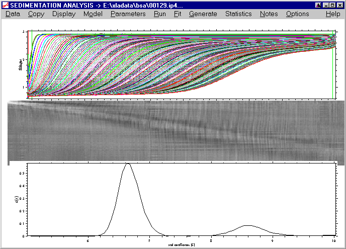
Displaying and exporting the distribution
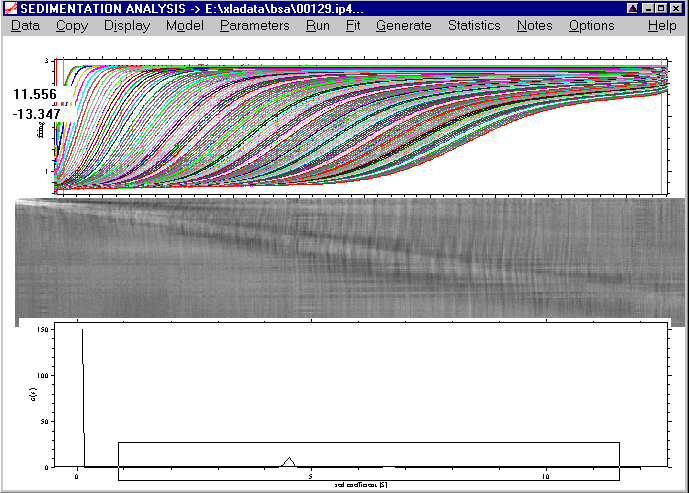
At this point, we can also remove the best-fit systematic noise, by either pressing ctrl-N, or using the display command, or using the button on the right upper corner of the scan plot. This will show us
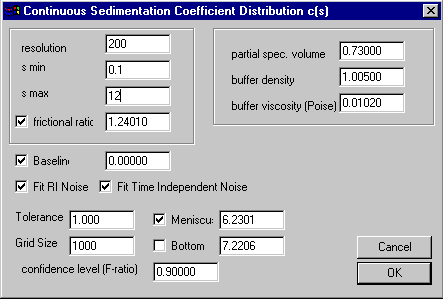
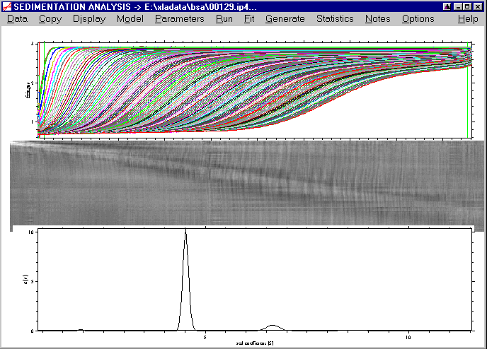
In a final optimization step, we can increase the distribution range a little more (s-min = 0.1 and s-max = 12), as there is still a peak at s-min and s-max, and we can also increase the resolution to a value of 200:
Click on the Run command (note that this will take a little longer now because of the higher resolution), and we get:
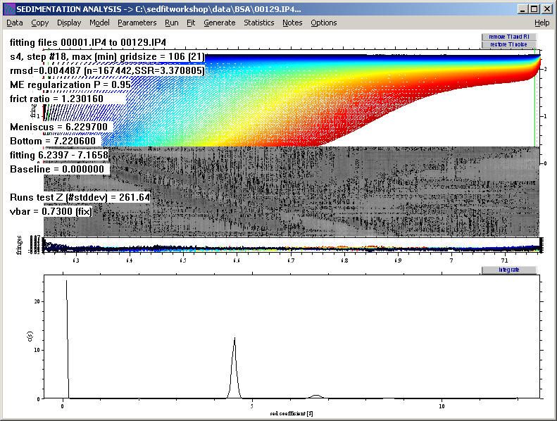
At first, this may seem like a worse analysis because the peaks almost disappeared. However, the c(s) plot only appears this way because of the rescaling to accommodate the very large peak at 0.1 S (which may not be a real species but a result of correlation of small s-values with the baseline parameters, see below). The fit has really improved, as visible by the further decrease in the rmsd to 0.00449.
NEW: In order to visualize the distribution better, we can use the new function 'Rescale Distribution Plot' in the sedfit versions 8.3 and higher. (In version 8.5 and higher, this is further simplified, see below).
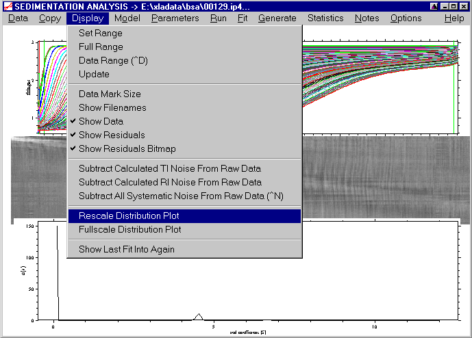
A message box will appear that reminds how this function works:

The mouse arrow will change into a crosshair, and by pressing the right mouse button, we can pull a rectangle while keeping the right mouse button pressed:
This rectangle will contain the s-Range of the new plot (the vertical dimensions of our mouse rectangle are irrelevant, the plot will automatically scaled):
If you keep the control-key pressed while double-clicking with the right mouse-button at the peak locations, you will get output about the estimated molar mass values from the c(s) analysis:
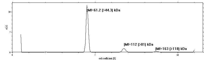
Here, Mf means the molar mass taking into account the current best-fit frictional ratio f/f0. In parenthesis, the minimum molar mass value is given, which is based on the hydrodynamic law that f/f0 > 1 for any macromolecule.
We can apply the same function again to zoom in on the species between 5 and 10 S:
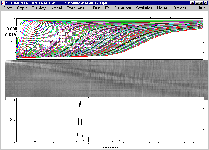
which results in a better view that visualizes clearly the third peak at ~8.5S.
We can go back by using the Fullscale Distribution Plot command:

which leads back to the original view of the distribution.
New: Please note that in version 8.5 and later, we can now directly draw a rectangle in the area of the distribution plot, without invoking the menu function. The distribution plot can be switched back to fullscale with a right mouse button click into the distribution plot.
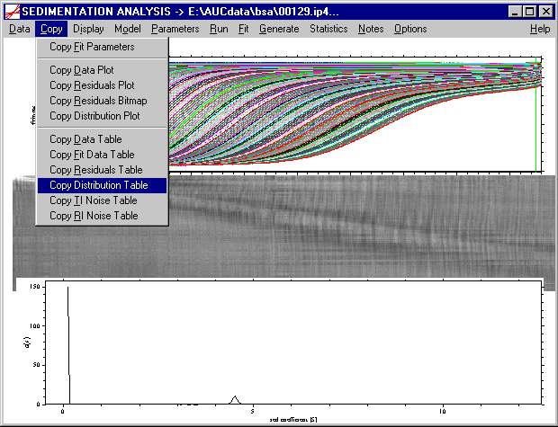
As a more flexible alternative, I recommend to copy the distribution data into the clipboard by using the following copy command:
Then, we can open a spreadsheet program for plotting, such as Origin, and paste the distribution data into a worksheet. (Alternatively, the distribution data can be saved to the hard disk as an ASCII file, and imported into the plot program.) There, we can conveniently rescale the distribution axis to inspect the final c(s) result, for example
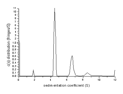
Please note the axis break at 1.0. Here, we can also use numerical integration functions to get the partial loading concentrations of the different peaks (area under the peaks, see below).
What does the apparent peak at 12 S mean? Since 12 S was our maximum value allowed for the distribution, it does not mean that the distribution includes species at 12 S. In fact it mostly indicates that there are species larger than the maximum s-value. This can be verified by increasing s-max to 15, which leads to the following distribution:
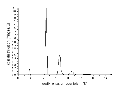
Here, the peak at 12 S has disappeared, and a very small abundance of species with > 15S is apparent. The rmsd value of this fit has slightly improved to a value of 0.004578.
While the peak at the value of s-min can in general indicate the presence of material with smaller s-value, it is possible that it is simply a result of the correlation between the baseline and systematic noise parameters and species with 0.1 S, in which case it may be ignored. This situation would be slightly improved if later scans could be included into the data analysis.
Note in version 11.0 or higher, this correlation is by default suppressed using Bayesian expectation for the absence of a peak at s-min. The fact that it still appears partially indicates that there may be a small buffer mismatch in the sample and reference sector that leads to a signal contribution from buffer salts.
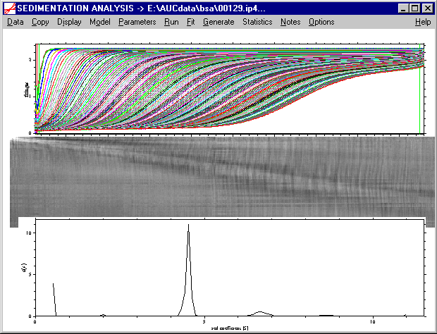
At this stage, using our knowledge of BSA, we can interpret the c(s) curve. First, we can integrate the areas under the peaks, either in the plotting program (such as Origin), or within sedfit:
With the menu function "integrate distribution" located in the Options-> Size-Distribution Options menu (or using the keyboard shortcut ctrl-i [version 8.5 and later])

a message box will appear that reminds that this function works exactly as the zooming tool for the distribution plot:
The mouse arrow will change into a crosshair, and by pressing the right mouse button, we can pull a rectangle while keeping the right mouse button pressed. Again, the y-value of the rectangle is irrelevant. For example, if we want to analyze the ~6.7S peak, we can specify the following range

Releasing the right mouse button after spanning the rectangle will immediately display the information

on the integration range, the loading concentration (0.25 fringes) of the material under the specified peak and it's fraction of the total loading concentration (3.8%), as well as the weight-average s-value of the material, which is 6.68S. It should be noted, however, that the fraction of the total material (the 3.8%) in our example does include the artificial peak at 0.1 S. In order to get the true fraction of the sedimenting material, we need to integrate over that range (e.g. from 1 - 15S, including all true peaks), which gives a total loading concentration of 2.17 fringes. Therefore, the loading concentration of 0.25 fringes from the 6.68S species corresponds to 11.5% of the total loading concentration.
This analysis shows that, in addition to the main peak from the BSA monomer, there is present a fraction (~1%) of small species (probably from proteolytic degradation), as well as 11-12% of dimeric BSA, 2-3% of BSA trimer, and probably a total of 0.8% of larger oligomers. The statistical accuracy of the s-values and the abundance of all species could be studied using the Monte-Carlo statistics function.